11 Sep The story of our logo
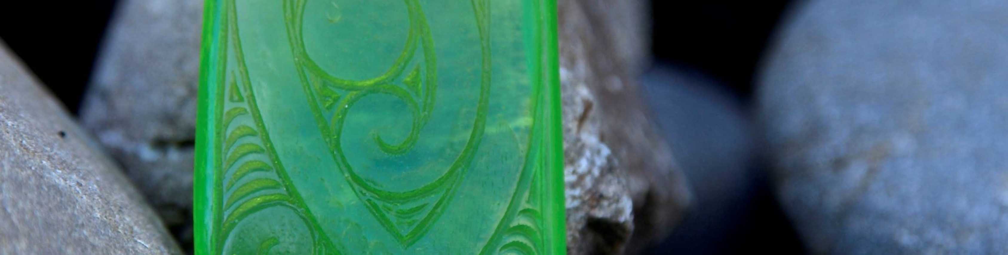
The Toi Tangata logo was designed by artist Tuteri Rangihaeata in 2013 when Toi Tangata was established as the trading arm of Te Hotu Manawa Māori. It draws on elements of both traditional Māori design, such as carving, and modern Māori visual and graphic design.
There are two elements to the design. The first allows us to look into the mirror and self-reflect while also making sure we look after our own whanau. The second is the entire face, the belief in ones-self along with whanau support to advance into the world.
The word Toi represents the art of life and living, while Tangata represents the human element of physical life and living, thus Toi Tangata; the art of human potential.
Drawing from the explanation of Toi Tangata, the logo represents the physical manifestation of life and elements which contribute to achieving the highest point in one’s life. The angle represents the highest point, which can be translated to maunga (mountain), whare (house), or ūpoko (head)– all of which are core elements in the development of health, economic prosperity, academic excellence and community.
The description of the design is as follows:
The top of the Mata is Toi; te Toi o nga Rangi, te Toi Huarewa, te tino tihi o nga Mātauranga.
Te Mata represents mankind, ngā tangata and a range of natural opposing combinations including male and female, young and old, life and death; it is the matrix to health and wellbeing.
Mata is the face
Toi is the summit
Rangi is the sky
Toi Huarewa, though explanations vary, is seen as referring to the way Tāne and Tawhaki ascended to the heavens or sometimes the whirlwind path to the uppermost of the heavens.
Te tino tihi can be referred to as the peak of knowledge.